Perhaps the trickiest part of decorating a space is deciding on the color scheme. There’s so many to choose from. There’s little leeway for correcting a mistake. And more importantly, there’s that pressure to achieve the perfect mood in the room.
But the safest strategy you can swear by, on any room in your home, is tone on tone. It’s quite similar to monochrome, only that it has variety in its some key design features. If you want to pull off the tone on tone, that’s what you have to focus on: variation in elements.
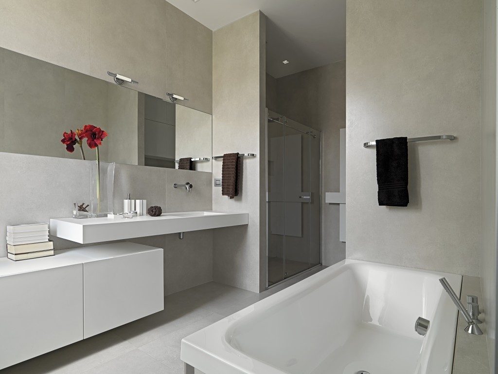
On Shades
The first thing you have to consider when going tone on tone is the lightness and darkness of the color of your choice. You want to stick to one color family, then introduce the variety in the shades. So for instance, in the bedroom, you went for white.
In your walls, to achieve that soft, milky backdrop feel perfect for rest and relaxation vibe, you can use Farrow & Ball’s Strong White. This shade doesn’t have pink or yellow undertones, so it maintains that pure white, ideal for adding a calm, peaceful atmosphere in the room.
On your floors, you may update it with Sherwin-Williams’ Dover White. Its warm, neutral look complements the snug feel of hardwood planks. As for your beddings, go for shades of white that lean towards cooler tones to balance everything out and make your sleeping area all the more inviting.
If you’re wondering where to buy pillows like in hotels and how you can get them without much hassle, hit up Google and check out online stores.
On Textures

More than the saturation, you should also do some variations on the textures of elements in your room. Texture pertains to how an element feels when it’s touched. Like for example the softness and silkiness of velvet couches or roughness of hanging tapestry art.
When there are different textures present in a room, even if it reflects just one color, the entire thing won’t look flat, because the different tactile qualities give off different points of visual interest. There are lots of ways to introduce texture. Use textiles.
Add kilim pillows in your living room, a table runner in your dining, and rugs all over the house. You may also use stone materials: marble on your floors and granite on your walls.
Even though these architectural elements and the textiles mentioned sport the same off-white look, they won’t look boring because of their embedded, unique characteristics adding visual interest, pulling off the perfect tone on tone.
On Focal Point
A focal point is necessary for any decorating project — but in the case of tone on tone schemes, you’d need it all the more. Why? Because the element that draws the eye avoids that flat look and gives an instant wow impression to people entering the space.
You may already have a built-in focal point in your room. You just have to build your design around it. For instance, if you have a ceiling that has interesting architectural molding, you may want to accentuate it further, say, by hanging a long, spiral chandelier to draw the eyes up.
If the space doesn’t have interesting built-in features, then create your own. Introduce statement furniture and place it at the end of the natural sightline from the entrance to the room.
Again, the key to achieving the perfect tone on tone palette is to focus on three major elements: shades, texture, and a focal point. Happy decorating!